Before we dive into Gutenberg, let me start with a very short history of WordPress/TinyMCE.
TinyMCE is the current default content editor built into WordPress, and it has been for quite some time. When I first started working with WordPress a great many years ago, TinyMCE was downright impressive compared to writing raw HTML or using simple text area-based CMS systems, especially when it comes to a client’s ability to edit their site’s content in a meaningful way.
TinyMCE was – and in many ways still is – a great (and prolific) WYSIWYG editor, not in the least due to its Microsoft Word-like interface. With its familiar look, TinyMCE (and other similar WYSIWYG editors) have empowered end users by giving them easy access to change font styles, text alignment, add images and video, update headers and insert links, among other things.
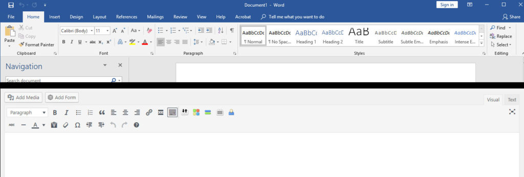
Comparing Microsoft Word (top) with TinyMCE (bottom).
A More Mature Web
But as Web 2.0 matured, and now Web 3.0 becomes more and more visible, it became evident that something more was possible. The advent of Software as a Service (SaaS) platforms like Wix and Squarespace offering supercharged WYSIWYGs allows end users to create good-looking websites with relative ease. Instead of just allowing text formatting and simple media additions, these services give end users limited access to the actual structure of the webpage.
This functionality is lacking in the core of WordPress. Themes and page-builders like Divi and Visual Composer, which further empowered end users with ability to change layouts in much more meaningful ways, currently fill this gap. Now the WordPress team has decided to bring this type of functionality into the WordPress core with the Gutenberg editor, and there is no shortage of controversy if you know where to look.
Saying ‘Guten Tag’ to Gutenberg
Many developers and content creators see no need for change, or believe that Gutenberg represents code-bloat as it’s not necessarily applicable to, or desired by, a vast majority of users. This is especially true when third parties and others working in WordPress currently produce quality solutions without “polluting” the core framework of what WordPress is. If this transition – which is happening, like it or not – is executed well and Gutenberg is accessible and powerful, the nay-sayers will be mostly quelled. If Gutenberg fails to deliver an acceptable experience – or worse, causes serious issues with existing sites – WordPress and its community could be irreparably damaged.
Design. Blocked.
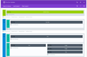
Divi’s backend editor makes it easy to see the “blocks” this page is built out of.
With all that said, changing the content editor in the most widely used publishing platform on the net – and perhaps in human history – is no small feat and not without its perils.
TinyMCE is a relatively small chunk of code that millions of people are personally, professionally and/or emotionally attached to – even if they aren’t unaware of it. But its approach to content creation is implicitly narrow. TinyMCE, like Microsoft Word, is designed to create documents. It is built with the point of view that a web page is a single document, made up of predominantly text, with images and perhaps a video mixed in.
This is often the case for news articles and blogs, although not for most home pages, landing pages, product pages, shopping carts, resource libraries and so on. These pages are often broken up into chunks that serve different purposes – sections that help move the visitor towards a desired end – or that provide a piece of media that could stand alone from the rest of the page.
Wix knows this and so does Squarespace, Divi, Visual Composer and a growing number of their peers. They all break down pages into sections or blocks. These work fine for more traditional documents, but have the added bonus of allowing for more involved page layouts. They also lend themselves to breaking a webpage up into smaller, more digestible chunks.
Building Blocks of Web
Using this approach makes consuming a webpage easier, but it also makes designing it easier. By extension, this also makes creating an intuitive way to edit all these things easier. This is, after all, the way developers have always written webpages, with tags like <div>, or years ago tables, or God forbid even iframes – all of which basically define sets of squares that have various attributes and “fall” toward the top left corner of the browser window like a topsy-turvy version of “Tetris.”
These pumped-up WYSIWYGs simply give users a way to put these tags – or more accurately sets of these tags – easily into a webpage. Instead of writing tags, you can just pick a predesigned section or block, drop it into the page and customize various attributes to meet your needs. So long as you provide a good variety of sections to choose from, you’ll end up with a pretty versatile page builder.
Movable Type – Sort Of
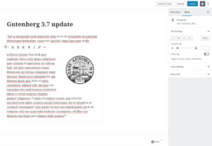
Gutenberg’s editing area is much less busy than its contemporaries. It is yet to be seen if this will be to its benefit.
Gutenberg also seeks to allow users to drop sets of blocks into a webpage as desired, but it takes a slightly different approach. Unlike Divi or Wix, which have relatively complex sections to choose from, the vast majority of Gutenberg’s blocks are very simple and serve a very specific purpose. Divi’s text module – its word for block/section – is more or less a TinyMCE-level WYSIWYG. You can write paragraphs and insert images with alignment. It can build a large copy block with hundreds of unseen tags, wrapped in the containers and columns that are ever-present in Divi’s interface.
Gutenberg’s paragraph block, by contrast, is meant to have one paragraph in it that can only be styled all together. For example, either the whole paragraph is green and stylized or none of it is. By and large, elements are applied throughout the entire paragraph, not individually to a single word or sentence. This can still be accomplished with a Classic block – TinyMCE wrapped into a standalone block, likely as a stop-gap while the editor is maturing. Custom blocks are also not only supported but encouraged, which is a game changer – but more on that later.
Gutenberg also has a hidden ace or two up its sleeve. Because it’s part of the core, WordPress itself will be altered and “taught” how to understand the blocks themselves. Shortcodes are great, but WordPress doesn’t so much know what they are individually as much as it knows what they do. A shortcode could be for anything – WordPress just runs the code associated with the shortcode and spits out whatever is returned. But with blocks, WordPress at its core, knows that this block is of a certain type. That type can then be defined, and WordPress can be made to do much more with that block.
Block and Tackle
Gutenberg’s granular approach to blocks is a good move for the future. It is also quite the heavy lift. Whether or not they succeed, the base theory is sound, and solidly rooted in computer science. They have a well-defined idea of a block that is versatile and a genuine improvement in terms of data. It will allow developers to leverage the WordPress API more fully, as WordPress itself will have better information about what makes up an individual page. This also means that third parties, like say Google, will be able to query more detailed information about a page if they choose to.
Once a block’s behavior becomes flushed out, it will just be a matter of creating blocks of the proper variety. Gutenberg already hits most of the basic necessities, and it will likely receive an avalanche of custom blocks and block sets from third-parties and individual developers as it rolls out and becomes accessible and used by the masses.
Reaping the Whirlwind
What does all this really mean for the WordPress community? It means things are about to change, and a bit more dramatically than they have in recent memory at that. For a lot of people, it will mean calling clients and explaining the change, or installing the classic editor plugin en masse to avoid taking on unnecessary work. It will mean learning a new editor, or holding on to the classic. It will mean embracing change, or resisting it. Some people will help others learn, some will discourage others from learning.
Some people are dreading this upcoming event. Others, like myself, have been waiting for this moment. Old plugins will become truly obsolete. New opportunities to add functionality will become available. Well-curated plugins will benefit from the added features blocks bring with them.
The WordPress team is taking a lesson from the father of mass media in Gutenberg. To thrive, however, members of the WordPress community will need to take a lesson from the father of evolution. Charles Darwin said “It is not the strongest of the species that survives, nor the most intelligent that survives. It is the one that is most adaptable to change.”
If you are a business owner with a WordPress site, you should take this opportunity to make sure whoever works on your website is ready and has a plan for how your site will handle the switch.
But if you are in the industry, I suggest you enjoy the ride and take occasion to make a few dollars, while you’re at it.
See more of JFG’s coverage of WordPress’ Gutenberg update in our previous post.
