This year marks JFG’s 16th. We were founded on Dec. 31, 2001 and opened in the aftermath of an historic snowstorm that brought more than 80 inches of snow to Buffalo. Running a business for 16 years is no small feat. So when Jack Martin, our president, and Carmel Cerullo-Beiter, our vice president, decided that a logo should be created to commemorate the occasion, they turned to JFG Art Director Aaron Niziol.
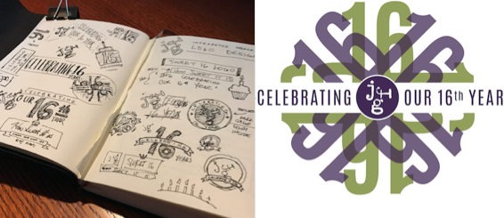
Aaron is never without a leather-bound sketchbook. He sketches at his desk. He sketches during meetings. Doodles cover page after page. Even Post-It Notes aren’t off-limits.
When he was asked to come up with a logo for our 16th year, we all knew the work would begin with a doodle. And doodle he did. He began with cupcakes and tiaras one night while he was enjoying a good King George English Porter. From there, the sketches evolved into something clean and playful. Here’s what Aaron had to say:
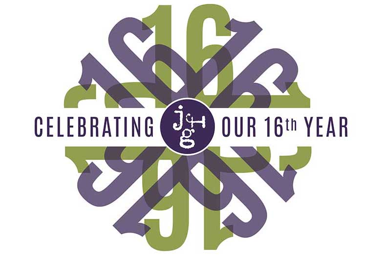
“I wanted some kind of a badge or stamp look. And it kind of started off looking pretty complex — you know, ribbons and text banners and stuff. But the more I nursed my beer, and the more I stripped away from the logo, the better it looked. It ended up accidentally … or maybe subliminally? … resembling a tiara. Sort of. If you cover up the bottom half and squint a little. But in all seriousness, I think our agency colors play well off of each other and with the transparency overlay effect, it resembles a wheel in motion. And that’s the kind of place JFG is: always in motion.”
See Aaron’s doodles and his final design:


